Blue
An app fostering community between all Wellesley athletes

Overview
Countless practices, high-intensity competition, and shared rituals naturally foster strong bonds within athletic teams. Yet at Wellesley, athletes have few opportunities to maintain these connections off the field and even fewer opportunities to create meaningful relationships beyond the silo of their own team.
Through contextual inquiry interviews, we found that athletes were seeking informal, social ways to stay connected with their teams and form new connections across varsity and club sports. In response, we designed Blue, an app named for Wellesley’s school color, to create a space where athletes can discover each others' events and share photos and updates, ultimately building a stronger sense community where all Wellesley athletes can motivate, support, and uplift one another.
The Process


Empathize & Explore
The Initial Concept
This semester-long project for my Human–Computer Interaction course at Wellesley began with a seemingly simple prompt: design an app related to athletics on campus. In our initial brainstorming session about the different lenses we could approach the topic with, my teammates and I quickly learned that we each brought different perspectives to the table. I was a club sport athlete, one teammate competed at the varsity level, and the other actually occupied both spaces. We soon recognized a common pain point: a lack of community between teams, especially between varsity and club sport athletes.
While our personal experiences helped surface this initial topic, we were conscious of our own positionalities and that designing from our perspectives alone would be limiting. We moved forward with a general plan of addressing the lack of connections between varsity and club sport athletes, and ensured our design catered to a plurality of perspectives by understanding the real challenges, needs, and goals of athletes across campus.
Research Methods
To design for Wellesley varsity and club sport athletes, we first had to empathize with their experiences. To begin doing so, we conducted contextual inquiry interviews with six athletes across teams, years, and leadership roles. Interviews took place in the Keohane Sports Center before or after practice to reflect a realistic use context of our app.
Our interviews focused on three core areas that would inform the direction of Blue:
Team Dynamics
Experiences within athletes' own team
Athletics Community
Current connections across Wellesley Athletics
Desired Features
How an app, framed as a platform inspired by both Instagram and Strava, could improve these experiences
Participants responded to open-ended questions spanning the three areas, providing valuable insight into their needs, challenges, and aspirations, which formed a strong foundation for our app’s specific goals and overall design direction.
Key Takeaways
We synthesized interview responses using thematic analysis to identify recurring patterns across the six participants responses. Two overarching themes emerged:
Athletes not only want to create bonds with other teams, but strengthen their own team dynamics.
"Sometimes it feels like each team is kind of in their own little bubble. But even with my own teammates, it’s still hard to keep in touch with everyone."
Athletes want an app that centers connections, not performance.
"I'd love a way to casually inspire others to workout, like by posting to a team page, rather than requiring and enforcing workouts as their captain."
Implications for Design
At the core of athletes’ relationship to Wellesley athletics is their relationship with their own team. When imagining a platform for all Wellesley athletes, participants emphasized the need for a home base, a space where they could motivate their own teammates, create inside jokes, and feel comfortable engaging. Our initial concept centered around a feed where all Wellesley athletes could interact with each others’ posts, but interview insights showcased the need for a team-specific feed as well, allowing athletes to engage both beyond and within their teams.
Participants also noted that what they value most in social fitness trackers like Strava isn’t access to others’ exact performance metrics, but the ability to stay connected to their friends’ athletic lives. In designing an athletics-centered app, we chose to center the athlete, not athleticism. Features such as a calendar of upcoming games and the ability to share photos and updates from everything from physical therapy to tournaments foster encouragement, visibility, and connection over competition.
Problem Statement
Athletes at Wellesley lack informal, intra-team and cross-team social opportunities, limiting their ability to form bonds that strengthen performance, morale, and a broader sense of community.
Ideate & Plan
Persona Development
Based on insights from our initial interviews, we created two distinct personas representing different user types, each with unique perspectives, challenges, and goals. This process reinforced our user-centered design approach, keeping empathy and real user needs at the heart of our work.

Catherine
Varsity Cross-Country & Track
Junior Computer Science Major
Catherine feels isolated after an ankle injury shifted her routine from daily practice to physical therapy. She uses Strava to stay motivated and follow teammates’ progress, though the app is less engaging when she can’t upload her own activities.
Goals
- Maintain team connections despite limited participation
- Complete physical therapy to return to competition
Challenges
- Feels isolated due to injury
- Struggles to stay motivated with repetitive therapy

Alexis
Club Ultimate Frisbee
Senior Biology & Religion Major
Alexis works hard to motivate her team to stay focused and attend extra workouts, hoping their effort will get them to nationals. She feels her dedication often goes unnoticed and unappreciated by varsity athletes, and even by her own teammates sometimes.
Goals
- Meet student-athletes from different sports
- Stay informed about campus athletic events
Challenges
- Scattered event information across platforms
- Few opportunities for inter-team networking
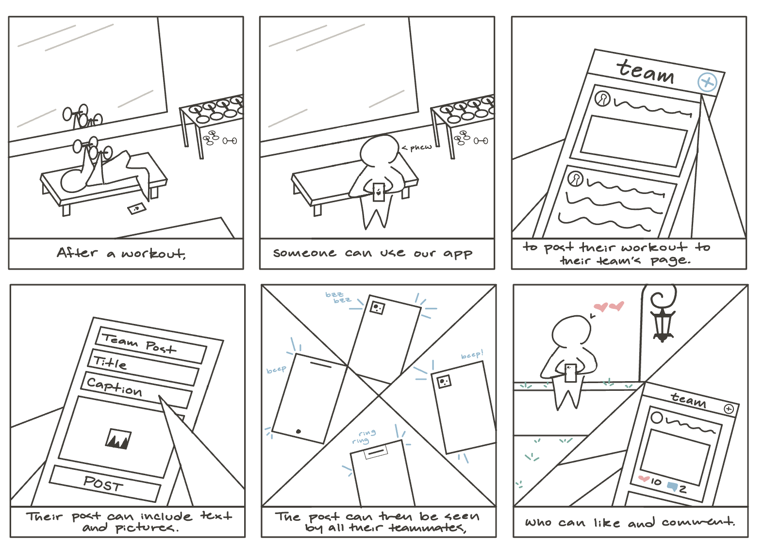
Storyboarding
We created a storyboard to visualize a primary use case of the app. It illustrates the context of use: where the user is, what they are doing, and their goals for doing so, as well as how the user interacts with the device to accomplish their goal and the resulting impact on their environment.
Design Direction
We developed two distinct design directions inspired by Instagram and Strava, tailoring their core features to better serve Wellesley athletes. By leveraging external consistency with widely used platforms, we aimed to enhance interface learnability, enabling new users to focus on meaningful connecting and engaging rather than navigating usability challenges.
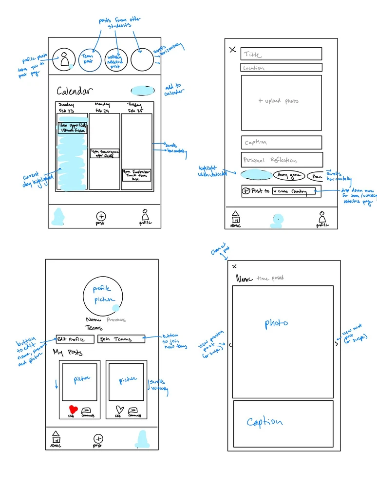
Design 1: Instagram-Inspired
Our Instagram-inspired design emphasizes social interaction, providing users a space to connect and share. The top of the home page features a horizontal scroll of 24-hour stories posted by Blue users, while the feed layout closely resembles Instagram’s familiar style, made unique through Blue’s integrated calendar of upcoming events.
Design 2: Strava-Inspired
The Strava-inspired interface centers on athletics and teamwork. Posts feature the names and profile picture for both the individual and their team, gamified badges drive competition, and the calendar of upcoming events is separated from the feed to distinguish modes of interaction.
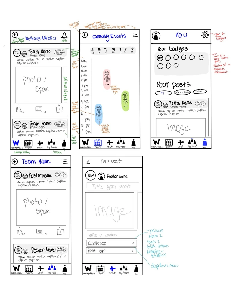
Moving Forward
Based on feedback from both design iterations, we moved forward with the second design, implementing key changes to improve usability and strengthen social interactions. A new “Today’s Events” frame will appear at the top of the Wellesley Athletics homepage, highlighting upcoming events in a way that balances visibility and clarity. From there, users can navigate directly to the full calendar page, addressing feedback from those who preferred a separate tab while reducing clutter on the homepage. To further improve usability and efficiency, we introduced a filter that allows users to sort posts by team.
Prototype & Test
Wireframes
Athletics
Calendar

New Post
Team
Profile
User Testing: Low-Fidelity Prototype
We conducted six usability tests of our wireframe with members of our target audience who we had not yet interviewed, having them complete a set of representative tasks and answer a series of questions to capture their impressions. This approach helped us observe where participants moved easily through the interface and where they hesitated or became confused, informing how we moved forward with our high-fidelity prototype.
Testing Protocol Tasks
- Post to the Wellesley Athletics page
- Find details for an upcoming Volleyball game
- Comment under a teammate’s post
Post-Task Questionnaire
- How would you use this app in vs. out of season?
- What was confusing?
- What suggestions do you have?
Key Findings
- Navigation worked well: tab bar icons were intuitive
- Profiles were clear: users understood badges + posts
- Posting flow: most could create posts with few issues
Pain Points
- Commenting was not intuitive
- Filter bar caused confusion (events vs. posts?)
- Horizontal calendar felt unintuitive
- Image upload interaction unclear
- “Post title” field confused users
Design Adjustments
- Switch calendar to vertical layout (Google Calendar consistency)
- Allow posting to both Athletics & team pages
- Replace comment icon with a clearer one
- Clarify photo upload options (upload vs. capture)
- Refine post creation page (title purpose clearer)
- Add ability to create new calendar events
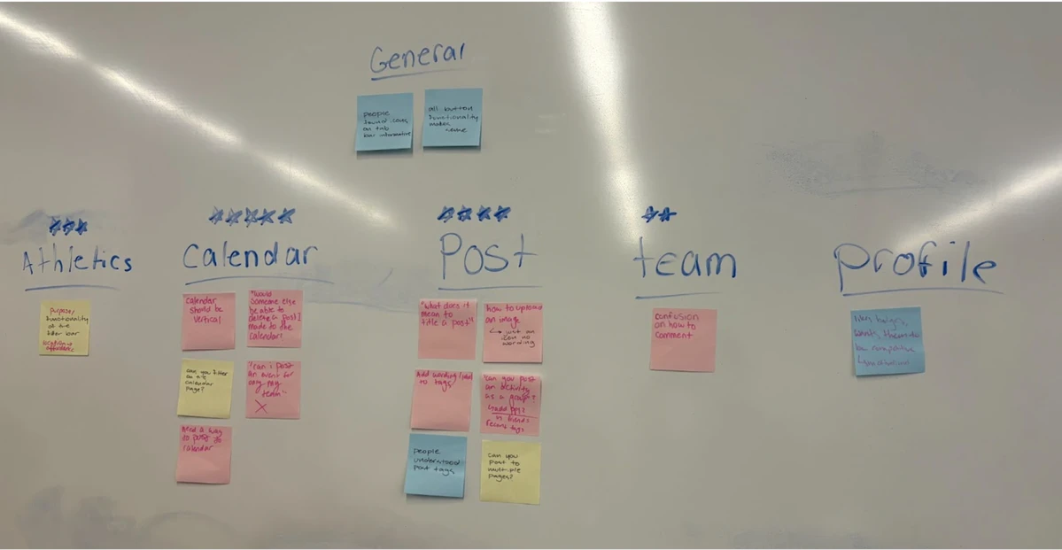
Affinity Diagraming
We used affinity diagramming to group insights from our low-fidelity usability tests by page, helping us identify patterns and recurring pain points. This allowed us to prioritize design improvements and make strategic decisions to address the most critical user needs.
Design & Refine
Brand Kit
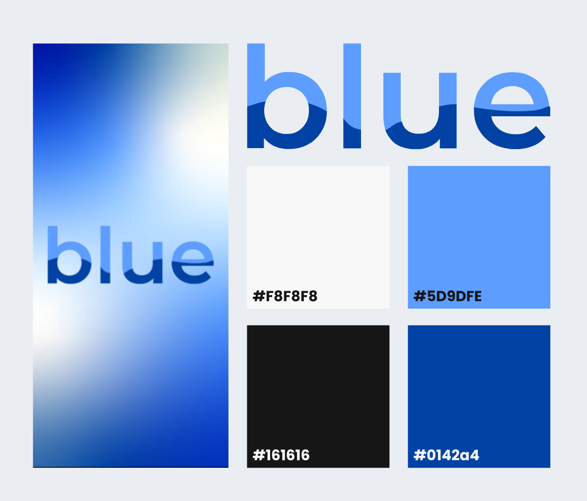
Kanit bold 32pt
Poppins bold 20pt
Poppins regular 16pt
The brand kit is clean, playful, and grounded in the identity of Wellesley’s community. Wellesley's distinct shade of blue paired with a vibrant lighter shade creates strong contrast against white backgrounds, while distinct headings establish a clear, consistent visual hierarchy across pages. The typographic logo evokes a sense of movement and energy.
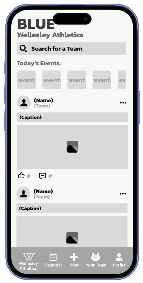
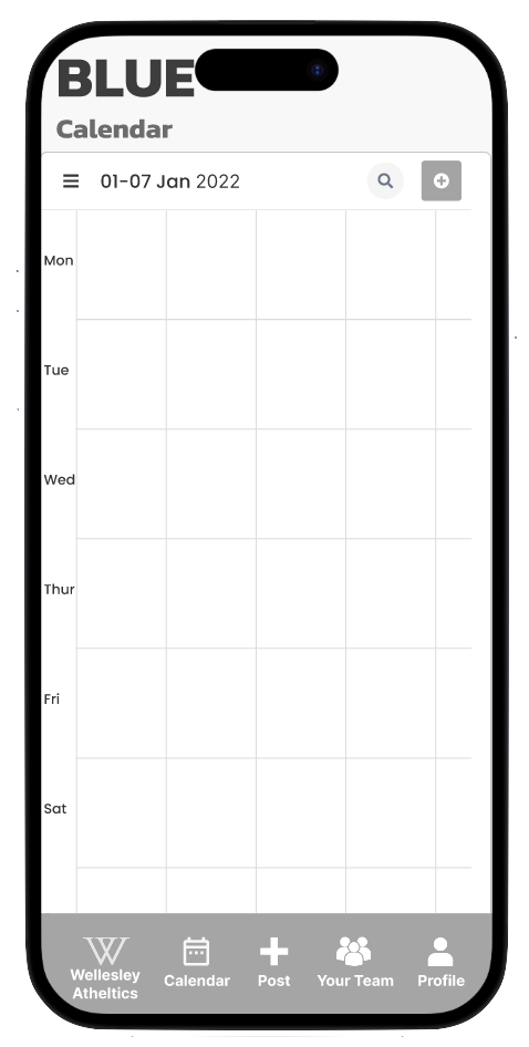
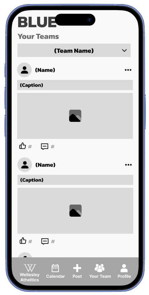
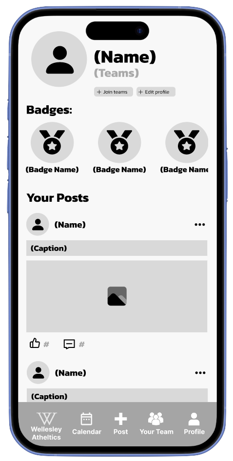
High-Fidelity User Interface
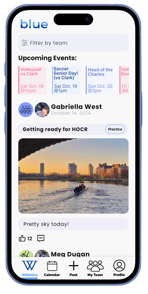
Athletics
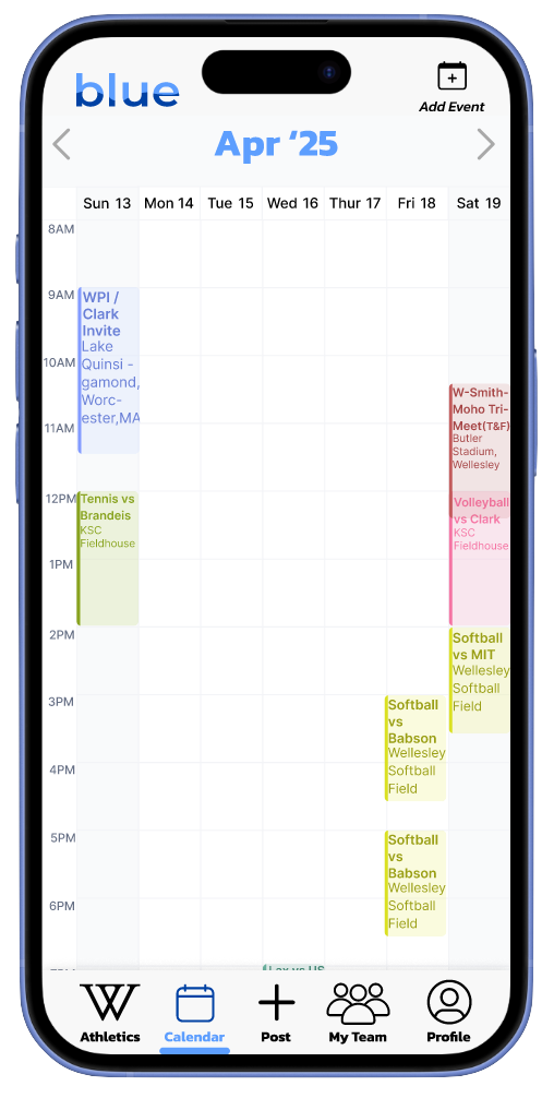
Calendar
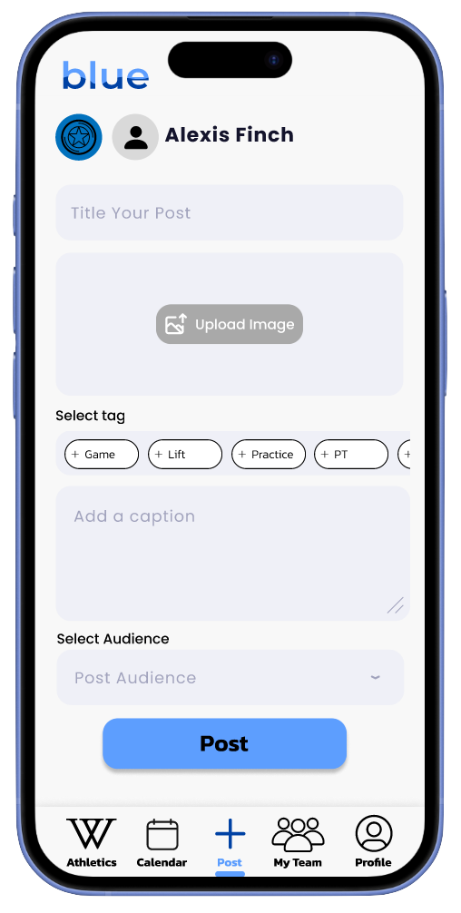
New Post
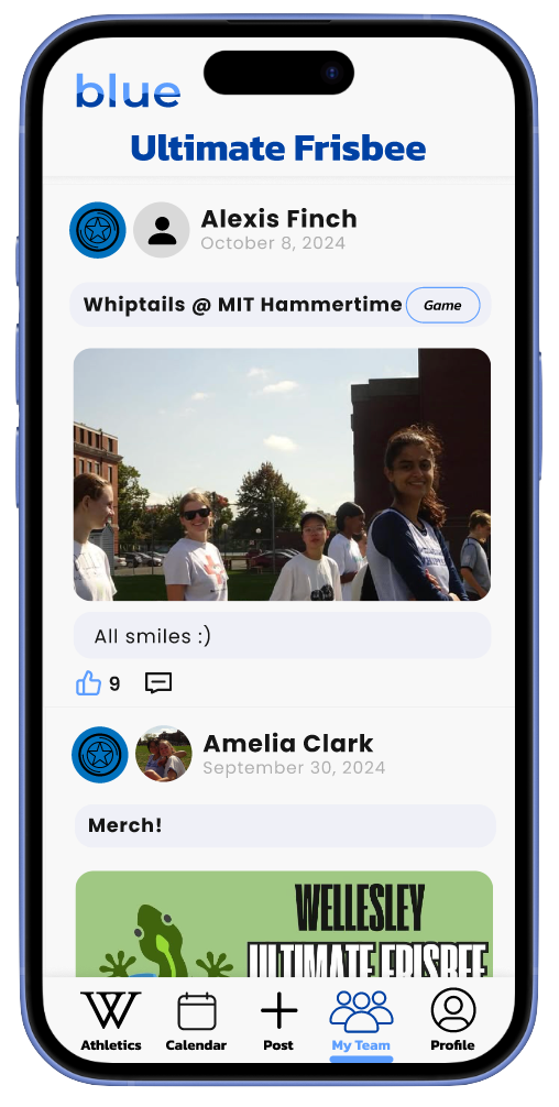
Team
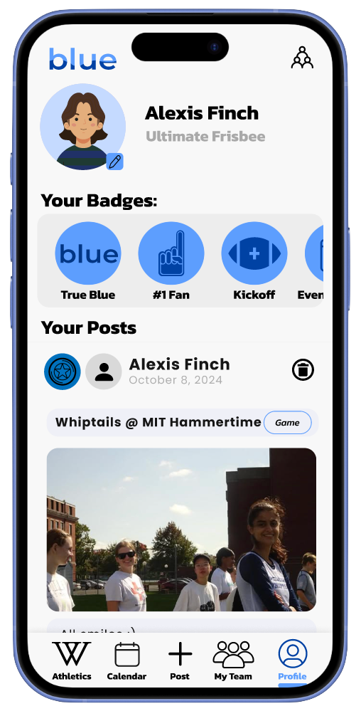
Profile
User Testing: High-Fidelity Prototype
Testing Protocol Tasks
- Comment under a teammate’s post.
- Create and delete an event on the Event Calendar.
- Locate Crew’s next race.
Post-Task Questionnaire
- Rank satisfaction from 1–10.
- Identify confusing parts of the app.
- Describe missing features or desired functionality.
- Note areas that were easy to use or successful.
Usability Metrics
- Total time taken to complete tasks
- Number of errors
- User-ranked satisfaction score
Average Metrics
- Total time: 3:03
- Number of errors: 1.83
- Satisfaction score: 8.83/10
User Testing Summary
| User | Total Time | Errors | Satisfaction | Key Observations |
|---|---|---|---|---|
| 1 | 3:26 | 1 | 9/10 | Confused by feed vs. event; liked inter-team bonding features. |
| 2 | 3:14 | 2 | 8/10 | Calendar intuitive; suggested scrolling improvements; profile edit button small. |
| 3 | 2:37 | 1 | 9/10 | Clarified "teammate"; suggested back button; enjoyed layout clarity. |
| 4 | 4:13 | 3 | 10/10 | Minor navigation confusion; clear layout; enthusiastic about app concept. |
| 5 | 2:48 | 2 | 8/10 | Event creation confusing; commenting and feed posting easy; liked Insta + Google Calendar feel. |
| 6 | 2:00 | 2 | 9/10 | Loved icons and commenting; slight confusion between feed vs. calendar posts. |
Design Adjustments
- Commenting was consistently easy and enjoyable.
- Visual layout, icons, and feed navigation praised for clarity and intuitiveness.
- Common confusions: calendar post vs. event post, Wellesley Athletics vs. Team feed.
- Suggested improvements:
- Increase size or labeling of the add event button.
- Add text to home bar icons to clarify differences.
- Include back buttons or navigation cues for calendar events.
- Overall, users were highly satisfied and excited about the app concept.
The Final Prototype
Through the app design journey, cycling through needfinding to high-fidelity prototyping and back again, I gained hands-on experience with the full design process, learning about human-centered design principles, effective collaboration strategies, and the technical skillset of UI / UX design. The process reinforced my understanding of the importance of early and plentiful user feedback, and how effective, meaningful projects are built iteratively with the needs of real people at the center.